This blog is going to be highly interactive. You will be asked to look at a number of screenshots. That being the case, I highly recommend you take a minute and go install cooliris. Once installed, you will be able to put your mouse on a small blue dot appearing next to any link on the page. Once you do that, another page immediately unfolds and lets you preview the link without actually clicking it. This will go much faster with cooliris. Once opened, you can use the four small icons at the top left of the page to either lock it down, expand it, send it to a new tab or close it. It really is a neat little hack. We were so impressed with it that we featured it as one of our "cool apps and Extensions" on Lobby4Linux.com
 A while back, I started a series on the KDE Desktop for New Linux Users. Parts one and two dealt with various components of the desktop and we concentrated on the heart of that desktop; the panel and system tray.
Now, for most KDE Users, that would be a wrap for the article. Well, helios believes if you have a good thing, expand that good thing and make it a better good thing.
(Did he really say "a better good thing?)
Because I use the KDE Desktop to its fullest potential, I want to help others realize how much you can expand the utilities of this environment. It goes farther than just grouping your system trays. Oh yes, in fact, my wife calls my desktop "Linux Command Central."
Here is how a new user can maximize the most efficient and effective environment in Linux.
And it's not me that says so. I get that straight from the penguin's mouth.
Exhibit A:
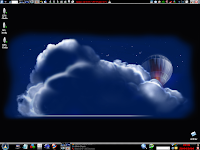
Clicking the thumbnail below will take you to our working desktop.
Let's begin by exploring that thin, powerful strip across the top. This is nothing but another panel. You can spawn one easily by right clicking on the bottom panel, choosing "add new panel" and then using your left mouse button, drag it to the top of your screen and deposit it there. As a note of interest, there are other types of panels pre-configured for you as well, available when you right click the existing panels. I simply choose this "raw" panel because it gives me the most flexibility in modifying it. You can as well, move this newly-created panel to either side of the screen. It doesn't have to reside at the top.
Starting from right to left, note that I have put my shutdown/lock button on the edge. There are a couple of reasons I do this but the main reason is because it's a corner and easily navigated without having to use much accuracy. As funny as that sounds, it's much easier to "corner" your target than have to pay specific attention to some colored bytes in the center of some othered colored bytes and click it. Now that I've given you plenty of reason to think I suffer from A-D-D, let's continue.
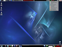
The little light switch looking thiny is actually my KDE Control Center. Since I'm in and out of there fifty times a day, it is much easier to isolate this menu than it is to constantly go into your start menu and dig it out from there. The next screen shot shows the ease by which you can choose your critical functions without having to dig them out of the menu dialog.
The two little blue globes represent one of the coolest features in KDE...at least in my opinion. These are directory servers. Yes...you can acutally set up directories on your computer to serve to anyone you wish with about 6 clicks of a mouse. No need to learn Apache, mysql or any of the other intimidating stuff that goes along with server stuff. Now I do recommend you learn the basics of Apache...but for now, and when you are in a hurry to get files to friends, this is the way to do it. Observe.
Right click the panel you wish the server to reside, then choose: "add applet." Once you do that, scroll down until you find the line that says "public file server." (This is SO cool). Click that and a blue globe will appear in the panel but it will be much "bluer" than the ones you see in mine. The light blue icon indicates that the tool has yet to be configured. Let's configure one now.
OK, got the icon in place? click it and it will pop up an indicator that says "new server". Good, that's what we want. Now when you click "new server" a box will appear that wants you to navigate to the directory you want to share. Remember, you are sharing an entire directory so it's best to make one especially for this server. Anything in this directory is going to be available to anyone who comes to that address. I personally make them as I need them. Let's say my partner in California needs my OEM copy of Crossover Office. It's 17 megs so email is out of the question for the most part. FTP will work but it is spotty iven in this new century. "KPF" as it's known is the perfect answer to this.
Alright, so you've chosen the directory you want to share. Clicking next will assign the port number to the server. KPF starts at 8001 and I normally go with what it assigns but you can change it if you like. Just remember to check and see if it conflicts with anything else and also remember to open that port in your iptables and router should that be necessary. The next click ask you what speed you want the downloads to go. It defaults to 4 KB/s.
Oh, that's not gonna piss anyone off, is it.
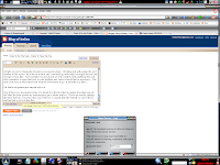
Now if there is a downside to this, I've found it in the fact that no matter how high you set the limit, the best speeds my downloaders get is about 40KB/s. That's not exactly smokin' the lines, but hey...it works when you need it to. I usually take the default "4" out of there and just put 4 9's in it, like this.
Click finish and you are ready to share files from the directory you chose earlier. Now, there have been some security concerns in the past but I've used this tool daily and have had over 50 people at a time in my share directory and I've never had a problem. That doesn't mean you won't so practice the "Linux way of Security." This has been a valuable app for me and I am surprised by the number of people who've used KDE for years and didn't know it existed.
Next in our app line up is my old friend kdiskfree. It comes as a default application in many distros and every distro I use, I make sure it is available. Now if you are a debian user, you might be money ahead using the kde-guidance tool, but since I am using Mandriva more and more, I find that kdiskfree, in conjunction with the sysinfo:/ tool, meet my needs nicely.
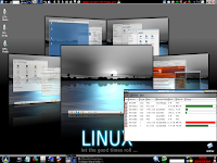
Kdiskfree is simply a disk mount/unmount/statistic tool. Now, I have had some problems with it from time to time. I want some place to go if my distro decides to look out for my best interests and refuses to auto mount my drives for me. I'm a big boy guys...I can take care of this. By not auto-mounting other drives, you are neutering the power of Linux and frustrating new users. One of the things I brag about in Linux is that I can open Windoze drives from Linux. If I have to jump through a bunch of command line mumbo jumbo to do it, it kind of defeats the purpose of it doesn't it. The Ubuntu folks and I went round and round about this. Thankfully, the boys over at Mint took the lead and fixed the damned thing...Ubuntu followed suit shortly after. OK, here's a look at kdiskfree.
While we're talking about files and file systems, let's look at the next icon to the left. That little red folder? That is an icon that represents the Root Konqueror GUI. I find it much easier to open a root file manager and work from that most times than I do opening my user file manager, clicking it to open as root and then going from there. I just cut out the middle man and do it this way. Either way, you must insert your root password and truth be known, there are times when just dropping yakuake down is much faster. But for those times when a root file manager is needed, this is a good place to keep it.
Most anyone will know the next icon as the K3b app. Need I say much here? It's only the best CD manipulation program in any Operating System or environment...
OK...here's where I start the fight. This next application is one I use all the time. It is actually the Xfce brother of KDE appfinder with one difference.
This one works...the KDE appfinder sux to the point that I wonder why it ever made it past KDE 3.2. No matter what apps you add, it always finds the same ol lame 18 or so apps and ignores anything else you might have in the menu. Another reason I like the Xfce version is that it has a smokin' search feature.
"But helios, the suse-style menu along with kbfx and tasty menu have this too."
You are correct, but the Xfce doesn't decide to arbitrarily close when I take my mouse focus away from it. The others don't do this all the time but often enough for it to drive me to the point of narcotic use.
Just kidding...
It takes much less than that usually.
Here, take a look and see what I mean.
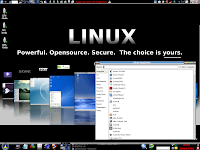
I simply find it much easier to use when I have to get to a seldom-used and thusly-buried app quickly. Of course this is a bit redundant when one uses the "run command" we talked about in the earlier article. As well, you have the option of using a program called "Katapult" as well.
Yes, that little blue cube waiting its time in the spotlight is frostwire. Of course I only use it for research purposes. It is probably the best p2p I've used, although I do have a great deal of respect for gtk-gnutella. I use that as well when I need to find that "hard to find" project. The next icon is a bit redundant to mention because most of us use it at least once a week. It's the famous and oft-used ksnapshot. These shots were taken courtesy of ksnapshot...it's one of the best thought-out pieces of software available to the Linux user today.
The joystick in the middle is my games. And for those who like planet penguin racer, have you played Extreme Tux Racer yet? Man it kicks....tux gets speeds never before reached in PPR and my fps increase dramatically when I use it as opposed to PPR.
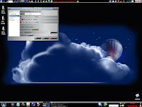
Red letters in the middle indicate my use of Kima. I had many people ask me what that "blue bar" at the top of my screen was during the last two articles. That was arron-stat and it's a superkaramba theme that fairly well rox. I have since preferred to use Kima. It gives me my cpu and memory use in something that resembles real time and is way more accurate than any Karamba hack I've used. Now you can checkmark other items as well, to include your processor type and the such but that is something I've found fairly easy to retain in memory...at least for now. I don't need it blaring at me in red letters at the top of my screen. I offer to you here a screen shot of the configuration gui of Kima so you have an idea of the other things you can display up top.
While the next app does occupy a good deal of real estate, I find it extremely useful. It is an applet (remember right click panel, add applet?) that allows you to manually mount/unmount and otherwise manipulate your individual drives. While I did cover this via kdiskfree and kde-guidance, I find just being able to click on an idividual drive without opening anything the fastest way to go. The one gripe I have about the storage media applet is that the individual drive identifier does not come up in a tooltip when moused-over. I am going to set a snake loose on this here in a bit and see if I can't fix it and if I do, I will upstream the hack/script to the developer or sourceforge. Really though, it's not much to remember which is which. They aren't really very playful scamps and won't change places when you're not looking.
"Why do you have two pager/desktop diddy-hoosits in your panels helios. One on top and one on bottom...what gives?"
My aren't we observant. The top desktop pager is meant for use with compiz-fusion. If you remember, your regular pager uh...let's see...there's a technical term for what it does... Oh yeah, your normal desktop pager SuX under compiz/3d composite managers. This one is made specifically for the 3d environment and acts like it should under said desktop. Remember though, it's in the additional programs in your package manager so don't forget to install it...it'll drive you nuts trying to find it otherwise.
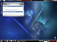
The little field next to the pager is actually a dictionary. Since Firefox spellcheck/dictionary seems to come and go at it's own will, I added it via the applet bar. Just type in the word you are looking for and hit enter. it will go into the bowels of your computer and dig around until it finds the definition it's looking for. Obligatory screenshot is below.
Our next two icons are old friends that really need no introduction. I just keep them up there because I use a 21 inch monitor and it's easier to stash often-used icons in strategic areas than it is to drag a mouse a few miles to a singular destination. Some would call it lazy...but since I am at this terminal for so many hours a day, little practices like this help me save time along the way. That's a good thing to practice if you are in the same situation.
That folks, concludes our mini series on "Doin' It For The Noob." As I am not the Omni-Smart Advocate, there are probably many things I may have overlooked...but again, that's why I write. I don't do this because I think you need to know what I think.
I do this so you can tell me what you think...and know. THAT my friends, is how we make this thing we do work.
All-Righty Then...


9 comments:
Nice desktop Helios - What is the name of the style and icon set you use? (Apologies if goes through twice!)
I'm presently running Ubuntu but I've considered switching at multiple points given some less than pleasant experiences with various limitations and issues.
What would you suggest as a good distribution for a very technically inclined but relatively inexperienced user?
If you don't care to respond (I'm sure you have better things to do) that's perfectly understandable, I was just wondering what your thoughts were here.
samw: I run sidux and I am very happy with it. It's a rolling distribution, based on Debian GNU/Linux unstable (sid), with additional tools that facilitates greatly the management of such system.
I am using the OS-K icons and you can get them from kdelook.org. In fact, there are some fairly new icon sets available that rock. Look for one from my friend Qbashi called Xiria. Another set that looks stunning is Mewls. Here is where you can do some cool things though. If some of these sets have the "buildset" included, you can replace the folder.png, kmenu.png and most any other permanent icon with another. Some icons cannot be changed via properties once they are in place. Doing this insures you get teh right one and you don't have to go into each folder and resize them to make the changes.
I am using the "metal4kde" style and it comes in the repositories from Mandriva and those distros evolving from it. There are also some versions of it for Ubuntu/mint but you will have to go to the mint forums and do a search for metal4kde.
I am perfectly happy with Mandriva;...the offshoots of it are pretty good as well, but I've found some instabilities in them that drive me nuts. Mandriva spring 2008.1 is fast, stable and nice to look at. If you've been using debian/Ubuntu for a while, it may take a bit to get used to the package management system but I've adapted well. You can even add a butt-load of good repositories from their easyurpmi site with a couple of clicks and I find that pretty cool.
I am running Sidux on my laptop right not and it is different to say the least. The script these guys have written to update the distribution is nothing short of genius and masterpiece...I simply think it's a bit too much for the new Linux User. for those who like to bork/fix rinse-lather and repeat, it is great. It is fairly good looking in its own right and I think the guys that put it together have done a wonderful job...but only for those who are more adventurous than most.
h
Well I'll look into both of those. Thank for you both for the thoughtful replies.
Very nice desktop, like it allot. Was just wondering what the wallpaper in your second and last screenshot is?
Hi,
In Linux we have a whole mess of desktops and if you need multiple files easily viewed we can just scroll thru them on the desktops.
In Windoze we only had one desktop and if you were working in multiple files at once you needed the space at the sides of the screen to get both windows in view.
I know this is a wild idea, BUT, I have a widescreen monitor and always have extra space at the sides but none at the top and bottom. Therefore, I have set up my taskbar or panels at the sides of my screen.
I've been happy to make them at least one size larger because they don't interfere with vertical area. I've followed Helios suggestions fairly closely in setting them up, I am a Noob. I've also put the things I use most on both sides, usually diagonally opposed.
The only thing I'm not happy with is that the names of things open on the desktops do not print vertically, but you can have icons in the line and they show up.
I'll post a screen shot in your forum if I can figure out how to use my ksnapshot program I just added to my side panel.
What do you think of using the panels on the sides?
Amenditman
Amenditman,
I took the liberty of moving this from the second installment to where you originally posted to here. This topic is covered here and it fits the tempo of the blog.
The reason I included it here is because I mention using the panels on the sides. For situations like you state, this is a perfect answer and it looks great. If you are having trouble posting the screen shot or taking one, email me at helios at fixedbylinux dottt kommm and I will take care of it for you.
h
Jorge,
You can get that wallpaper from my server if you like. It is no longer at the place I downloaded it so I am unable to give the proper credit. I do remember it was released under gpl2. I only use images that are licensed for free use.
http://www.lobby4linux.com/images/Poignant.jpg
Post a Comment